

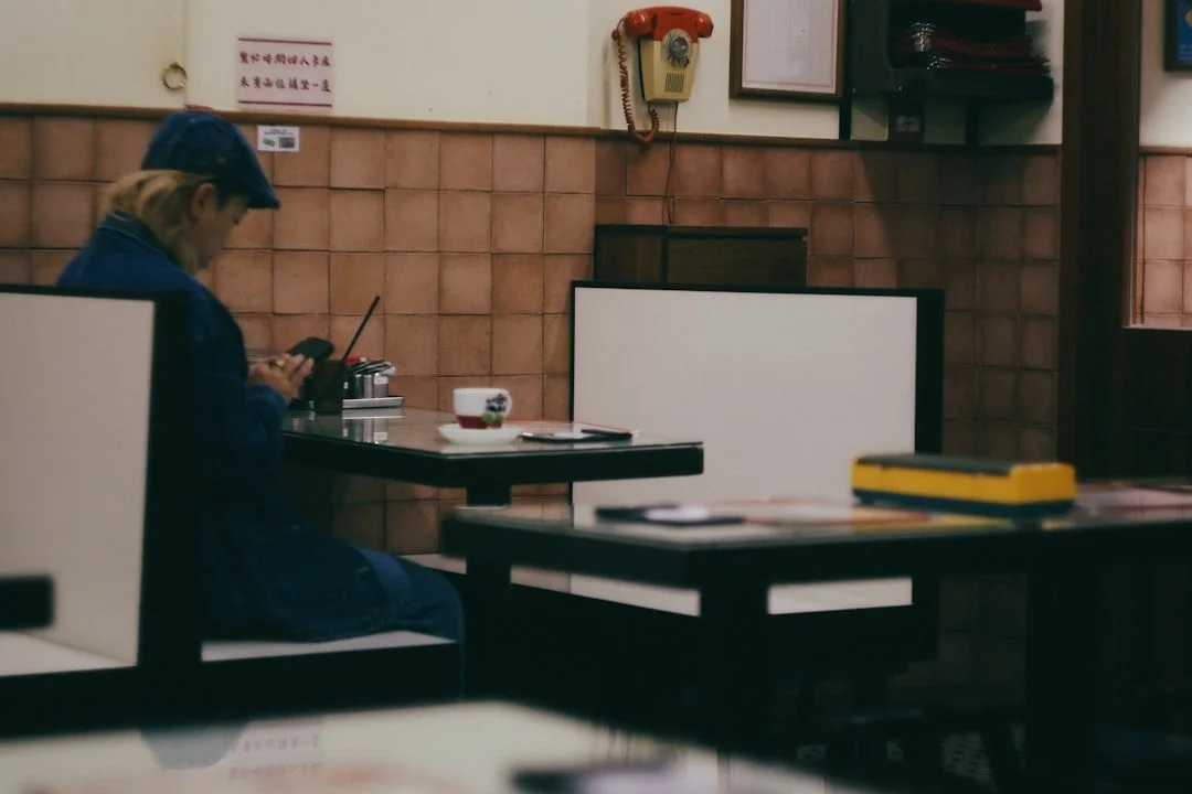
People decide fast, and usually on their phone
Picture the moment someone lands on your site. It’s Friday evening, they’re standing outside on the high street or sat on the sofa, and they want to eat somewhere in the next hour. They have three questions. Are you open? What’s the food like? Can I get a table? If your website answers those in a few seconds, you win the booking. If it makes them dig, they close the tab and try the place two doors down.
That’s the whole game for hospitality sites. It isn’t about looking flash. It’s about removing the tiny frustrations that sit between a hungry person and a confirmed table. We’ve watched session recordings of restaurant sites where people tap the same greyed-out button four times before giving up. Small problems, real lost covers.
Over half of restaurant traffic comes from a phone, and for evening and weekend searches it’s higher. So the honest test is this: pull your own site up on your mobile, on 4G not office wifi, and try to book a table for tonight. Time it. If it takes more than about thirty seconds or you have to pinch-zoom to read anything, that’s your first job.
Put the menu where people can actually read it
The single most common mistake we see is the menu as a PDF. Someone taps it, waits for a heavy file to download, then gets a tiny document they have to zoom around on a small screen. Some phones open it fine. Plenty don’t. And search engines struggle to read the words inside a PDF, so you lose out when someone types “sourdough pizza Chichester” or “gluten free breakfast near me”.
Put your menu on the page as real text. Proper headings for each section, prices next to each dish, and clear labels for vegan, vegetarian and allergen-friendly options. It reads instantly, it works on every device, and Google can index every dish you serve. If your menu changes often, that’s an argument for having it in your CMS where you can edit it in a minute, not for hiding it in a file you have to re-export every week.
A menu buried in a PDF is a menu most of your phone visitors will never properly read. Put it on the page as text and you’ve solved a design problem and an SEO problem at once.
Think of a menu page the way an online shop thinks about its listings. The same rules that make a good product page make a good menu section: clear names, a short honest description, the price shown, and no friction between wanting the thing and acting on it. Names people recognise beat clever ones, and a line of description does more work than you’d expect.
Photos sell the room and the food
People eat with their eyes first, and nowhere is that truer than a restaurant website. Stock photos of generic pasta do nothing. They might even hurt, because regulars know it isn’t your kitchen. Real photography earns trust instantly.
You need three kinds of image:
- The food. Your actual dishes, shot in decent light. A few hero plates, not forty blurry ones.
- The room. Show the space so people know what evening they’re booking. A cosy corner, the bar, a sunny terrace. This sets expectations and cuts down on people arriving somewhere that isn’t what they pictured.
- The people. A shot of the team or a full room on a good night signals a place worth being. Social proof without a single word.
One warning. Big image files are the number one reason restaurant sites feel slow, and slow sites lose bookings before the page even loads. Every photo needs compressing and sizing properly for the web. Our practical guide to image SEO walks through how to do that without a developer, so your gallery looks great and still loads in a blink.
Make booking a table stupidly easy
This is where the money is. A beautiful site that makes booking hard is a leaky bucket. The booking action should be visible the second the page loads, sticky on mobile so it follows the visitor down the page, and it should take as few taps as possible.
A few things that lift bookings again and again:
- One clear primary action. “Book a table” as a button that stands out, repeated at natural points down the page. Don’t make people hunt for it.
- Click-to-call on mobile. Plenty of diners, especially for same-day tables, would rather ring you. Make the phone number a tap-to-dial link, not plain text they have to copy out.
- A booking widget that doesn’t fight the phone. If you use a system like a table-booking tool, test it on mobile properly. Fiddly date pickers and tiny fields kill conversions.
- Honest availability. If you’re fully booked Saturday, saying so and offering Friday is better than a form that fails at the last step.
If your booking runs through a form rather than a third-party widget, the details matter more than most owners think. Field count, labels, error messages, the wording on the button. We’ve written up the small changes that move the needle in our guide to form optimisation, and most of them take an afternoon.
The trust details that tip a decision
Choosing where to eat is a small leap of faith. You’re asking someone to spend an evening and a chunk of money on a place they may never have visited. Little signals do a lot of quiet work here.
Show your opening hours clearly, and flag anything unusual like a kitchen that closes at 9. Put your address on the page with a map, not just a postcode. Display a handful of recent reviews with names, because a real quote from a real diner beats any claim you make about yourself. Add the practical stuff people worry about: parking, step-free access, dog friendly, high chairs, whether you can cater a big group. Each one removes a reason to hesitate.
None of this is glamorous, but it’s the difference between “looks nice, but I’m not sure” and a booking. We’ve pulled the whole pattern together in our piece on the trust signals that influence buying decisions, and hospitality is one of the sectors where it matters most.
Get found by the people nearby
Most restaurant custom is local. Someone in your town, searching for a type of food, tonight or this weekend. That means two things need to line up: your website has to make sense to Google, and your wider local presence has to match.
On the site, name your town and dishes in your page copy and headings the way real people search. “Independent coffee shop in Bognor Regis” beats “Welcome to our establishment”. Keep your name, address and phone number identical everywhere they appear. Add structured data so search engines understand you’re a restaurant with these hours, this menu and this price range, which can earn you richer listings in search results.
Off the site, your Google Business Profile does heavy lifting for the map results people scroll before they ever click a website. Reviews feed that too, and they influence both your ranking and the human reading them. If local visibility is where you want to focus first, start with our practical guide to local SEO, then tighten the conversion side of the site so the traffic you earn actually turns into covers.
Where to start if this all feels like a lot
You don’t have to fix everything at once. If I could only change three things on a typical cafe or restaurant site, it’d be these: get the menu onto the page as real text, add proper photos of the food and room, and make the booking action impossible to miss on a phone. Those three alone move most sites forward.
After that, the gains come from steady tightening. Faster pages, clearer trust signals, better local details, small tweaks to the booking flow. That mindset of small compounding improvements is exactly what conversion work is, and you can make real progress without a big budget.
We work with independents and small hospitality businesses across West Sussex, and the pattern holds whatever the cuisine. Answer the three questions fast, remove the friction, and let the food do the rest. If you’d like a hand turning your site into something that fills tables, get in touch and we’ll take a look.
Frequently asked questions
On the web page as real text, every time. PDFs are slow to load on phones, awkward to read without zooming, and search engines struggle to index the dishes inside them. A menu built into the page reads instantly on any device and helps you show up when people search for specific dishes.
It’s the priority. More than half of restaurant traffic comes from phones, and for evening and weekend searches it’s higher still. Most people deciding where to eat tonight are doing it on mobile, so if your site is hard to use on a small screen you’re losing bookings at the busiest moment.
Speed and clarity. A visitor wants to know if you’re open, what the food is like, and whether they can get a table, all within a few seconds. A visible booking button, click-to-call on mobile, real photos and clear opening hours remove the hesitation. Friction at any of those steps sends them to a competitor.
Yes, a lot. Real photos of your actual food, the room and a busy night build trust and set expectations in a way words can’t. Generic stock images do nothing and can even hurt, because regulars know it isn’t your kitchen. Just make sure images are compressed properly so they don’t slow the site down.
Line up your website and your wider local presence. On the site, mention your town and dishes naturally in your copy, keep your name, address and phone number consistent, and add structured data so search engines understand your hours and menu. Off the site, keep your Google Business Profile accurate and encourage recent reviews, since the map results drive a lot of nearby diners.