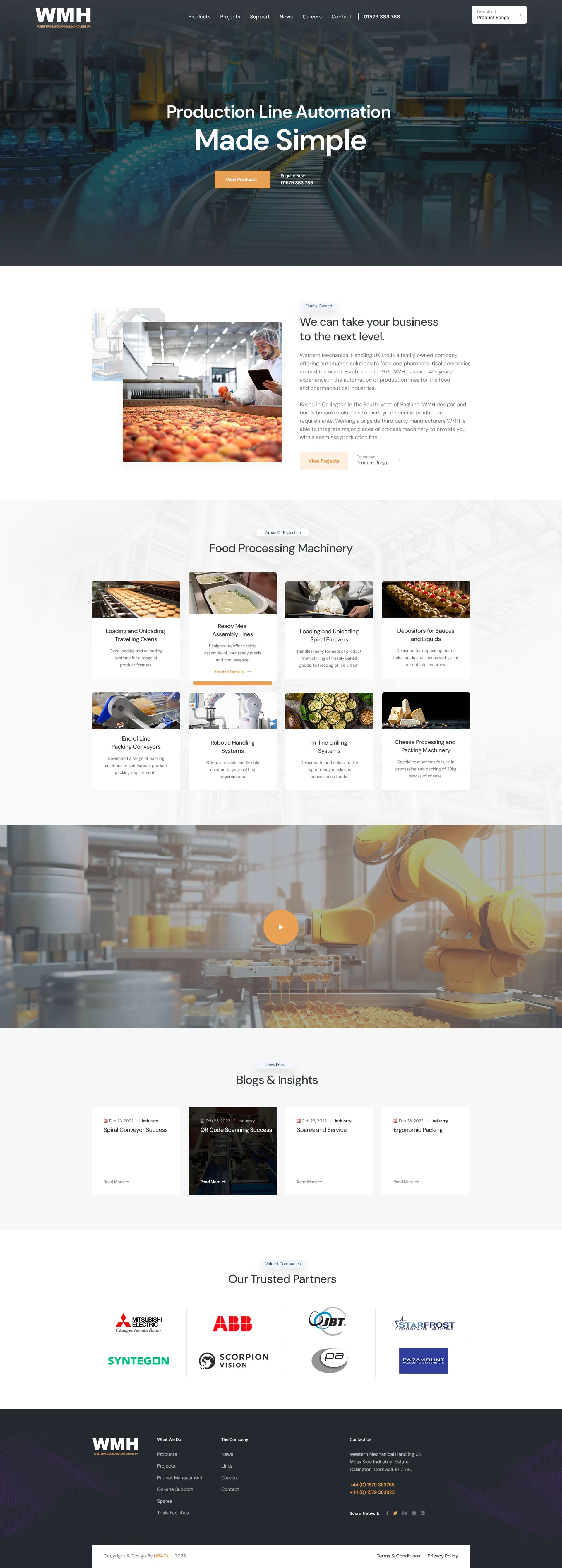
WMH, a precision engineering and fabrication specialist, had an outdated and fragmented website that failed to project a professional image and generate enquiries.

Solution
Combining two websites to streamline UX
We created a modern, unified website with a streamlined user journey and a professional design that showcases WMH’s machinery and services impressively. The site features high-quality images, a clear sitemap, and a prominent video in the main banner to engage users quickly. Additionally, we included clear call-to-action buttons to encourage enquiries.
Since the launch, the site has seen a significant increase in user engagement and enquiries, laying the groundwork for future SEO improvements.
Results
Improving perception
Increased enquiries
A significant rise in the number of enquiries received through the website, contributing to business growth.Improved UX
Positive feedback from users about the streamlined navigation and professional design.Enhanced online presence
A more credible and professional online image that better reflects the company's capabilities.
Improving UX at the forefront
The streamlined user journey and enhanced visual appeal have led to an increase in enquiries.
By addressing the challenges of the outdated design, fragmented user experience, and lack of enquiries, the new website now effectively supports WMH’s business objectives and positions them as a credible leader in their industry.

