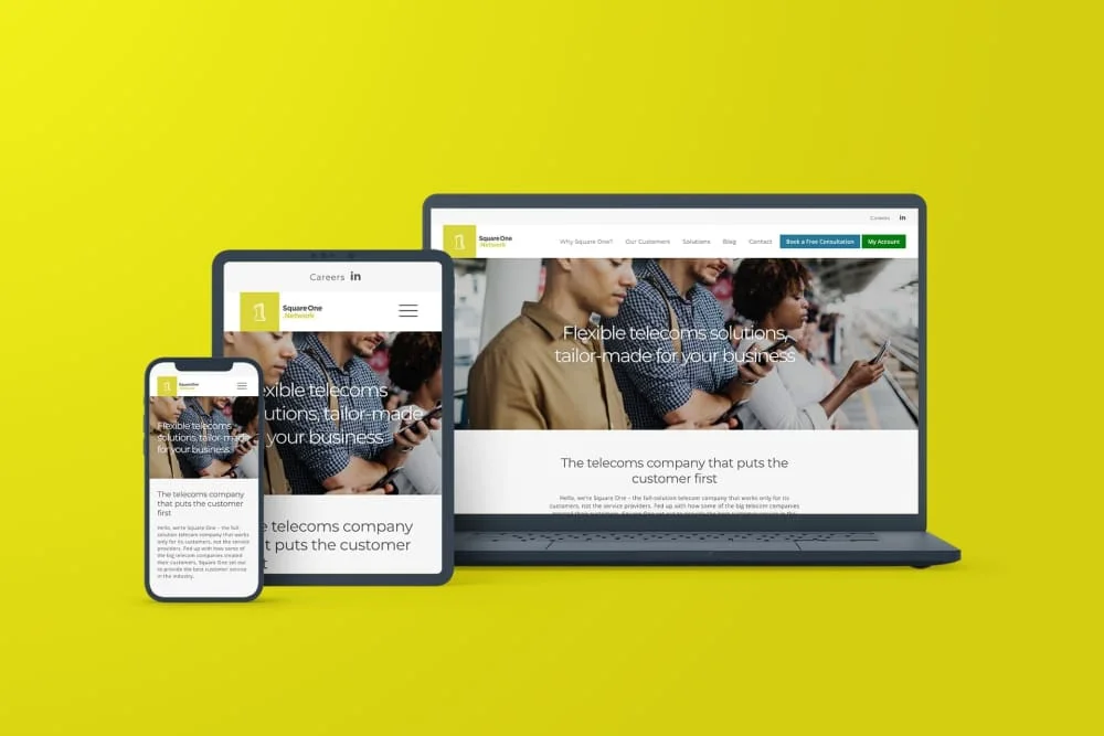
Square One Network, a new B2B telecom provider, needed a user-friendly website. Their clunky, outdated site frustrated clients and hindered growth.

Solution
Clean design based on target audience research
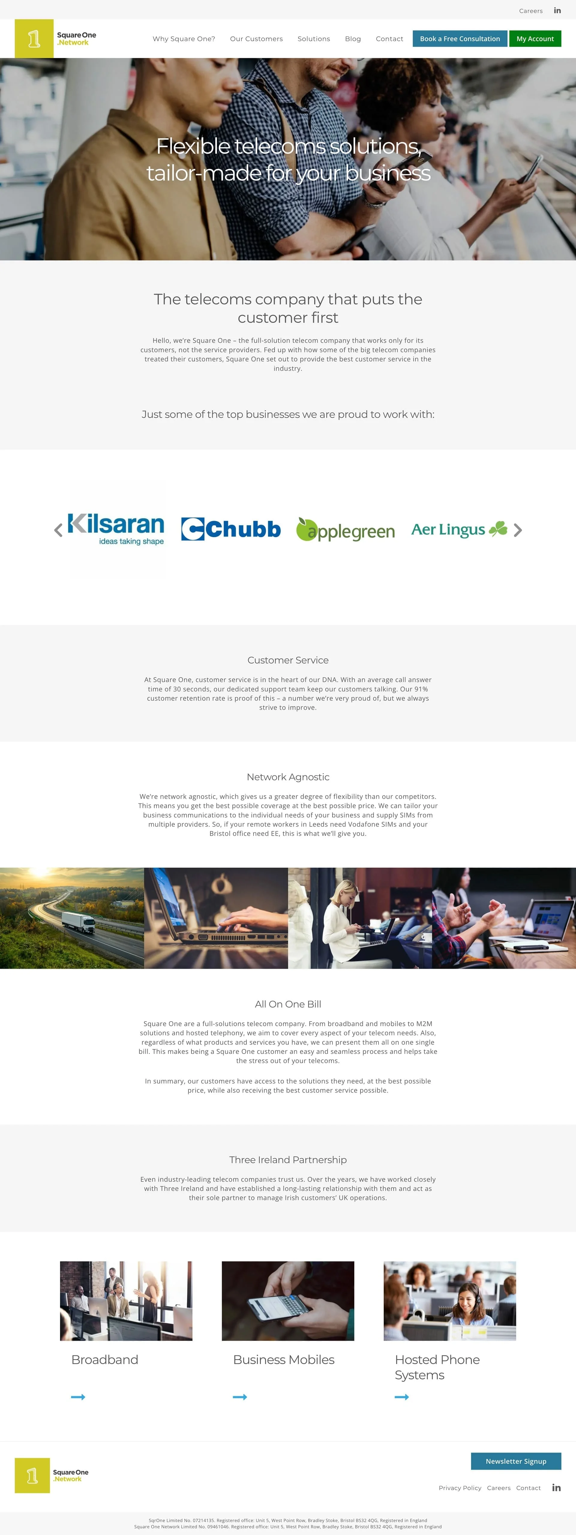
We conducted in-depth target audience research to understand the needs and expectations of businesses seeking telecom solutions. Based on the research, we designed a clean, minimalist website built on the user-friendly WordPress platform. This not only provided a visually appealing experience with ample white space but also empowered Square One Network with the ability to easily update content themselves.
Results
Saving time to increase profit
Simplified website management
The WordPress platform provided Square One Network with a user-friendly content management system (CMS), allowing them to update information, add new services, and manage their website independently.Enhanced user experience
The clean design with clear navigation and calls to action improved user engagement and streamlined the customer journey.Increased brand clarity
The minimalist design with strategic use of Square One Network's brand colours ensured a consistent and professional brand image.
User-centric design success
Clean, minimalist website aesthetics enhance user experience and brand clarity
The user-centric web design built on a user-friendly platform allowed Square One to manage its online presence effectively. In-depth target audience research was crucial for creating a website that resonates with their ideal customer.
Thanks for all your hard work on realising our vision for this project. You have saved us so much time by making the backend of the site so simple to populate.
Telecoms, Bristol
